Friday 4 April 2014
Tuesday 1 April 2014
Monday 31 March 2014
Evaluation - Question 1
In what way does your media product use, develop or challenge forms and conventions of real music productions?
I would say that our music video uses, develops and challenges forms and conventions of real music videos with inspiration from real music videos, TV programmes and films and by following rules of music video editing.
Analysing our video according to Goodwin:
Our music video completely adheres to
the rules and conventions of Goodwin’s music video analysis, with strong
elements of voyeurism, linking to the notion of looking. The first line of the
chorus in the song highlights, “Girl I want to be with you all of the time, all
day and all of the night”, In what we played off of this theme. The music video
shows the male staring at the girl which is followed by a tracking shot of the
female walking but secluding everything but her legs. This particular shot
creates an element from Mulvey’s ‘Male Gaze’ theory as the camera lingers on
the woman and the event is created from the context of a man’s reaction. Furthermore,
these particular shots are placed deliberately during the first line of the
chorus where it matches the lyrics of the song in order to emphasise how the
band members perceive this woman, but also how the female audience must
experience the narrative secondarily by identification with the male. It also
shows that I followed Goodwin’s convention of illustrating the relationship
between lyrics and visuals. 
Our music video comes under the category of a narrative performance, with it being split almost half between continuity and jump cuts. This follows the conventions of many music videos, with continuity highlighting the bands aspect but then jump cuts establishing the rock genre characteristic, again following Goodwin’s analysis.


A direct relationship between music and visuals was created through the 1960’s theme that was created with the modern twist. Furthermore a direct link can be made to Levi-Strauss Binary Opposition theory in the way that proxemics are used. Clothing is a key factor in order for the mise-en-scene to have features of the 1960’s era, the male characters wear suits (creating masculinity) and the female in a dress (creating femininity) which indicates the obvious gender roles. The jump cuts furthermore indicate this by indicating specific close ups of the genders body’s, which in turn adheres to the demand of close-ups from the record label. The music video features binary opposition in the way that the jump cuts of the males are more frequent which indicates this patriarchal society that men hold the dominant roles in society and women hold submissive roles. The context of the music video relates to this point as that was how society was in the 1960’s where women wanted to break out of the ‘private sphere’.

Analysing our video according to
Vernallis:
The music video also fits with
Vernalli’s conventions, especially in the post production process of editing
the video. Vernallis states that editing in music videos break all rules of
continuity, which was used throughout the music video. The music video was
edited by breaking the 30 degree rule by using jump cuts which often cut to a
variety of shots, (establishing, close up, extreme clos up and medium shots) on
many occasions. The editing also matched the beat and musical phrases of the
song. 
However
the music video did slightly challenge Vernallis narrative conventions,
following a more filmic form. Vernallis outlines that the narrative shouldn’t
have a clear resolution or an ending, but in my music video I do. My video ends
with the band members not being successful in winning the woman over and that
she was not oblivious to them the whole time she purely wasn’t interested in.
The ending is clearly represented to the audience which they should understand
when the woman walks away with a different guy.

Album Cover:
The Album Cover for the Kinks also follows forms and conventions of real album covers. The front cover is a large picture of the band which infers the genre of pop but with an alternative rock aspect due to the placement and poses of the artists. The purpose of this was for the audience to establish the bands identity which links to McQuails ‘Uses and gratification’ theory of the audience gaining an insight into one self, (similar personality of the band). As our cover shows a lot about our band, it follows the conventions of album covers, as the image on the front of an album cover should be striking and show the artist identity. The bands logo is written in large and the album name written a little smaller in order to create sizing hierarchy of importance. The image on the front cover continues the narrative of the music video which helps the target audience establish the band instantly as the storyline continues.
The insert of the album also follows rules and
conventions as elements of the didgi pack include convergence from iTunes,
Spotify and a QR code generated for easy access to the website. As a group we
decided that this was an important feature to include due to the advancements
in media as nearly everything single product we have created can be accessed by
one device, (complete convergence).
The
back also follows all the rules and conventions too, with all the essential
information; bar codes, institutional information and barcode. The back cover
also portrays the identity of the band as the image is the exact same as the
front cover but taken from behind the band members.
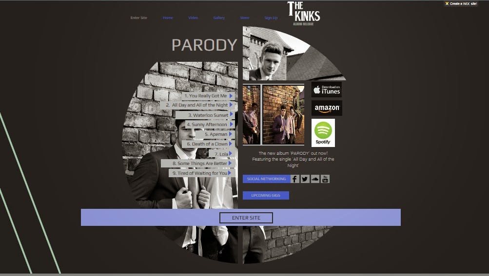
Website:
The website that was made for The Kinks also followed forms and conventions of real artist’s websites. We made all appropriate pages; Enter Site, Home, Video, Gallery, Store and Sign Up. Through research it was found that many artists’ website pages have an ‘Enter Site’ page where the advertisements for the product are displayed, from the album on where to buy and general information. Links to Twitter, Facebook and YouTube were also put in place on this page to give the target audience the opportunity to keep updated on news. The discourse of the homepage was in columns where information consisted on news of the band and tour dates to select from. Every page had the navigation bar at the top in order to flick through the pages of the website like they would be able to on a real website. The theme of the website was also kept consistent, (black, white and blue) with a standardised font used throughput the website.
However, we did challenge the conventions by using Wix, a flash generator site. We did not create the website from scratch like an artist would usually do but instead used a template in order to create and develop a site that fitted the bands image. Furthermore we had experience in using Wix last year at AS and thoroughly loved how easy the generator was to use and develop a professional looking website.
Thursday 6 March 2014

Subscribe to:
Posts (Atom)